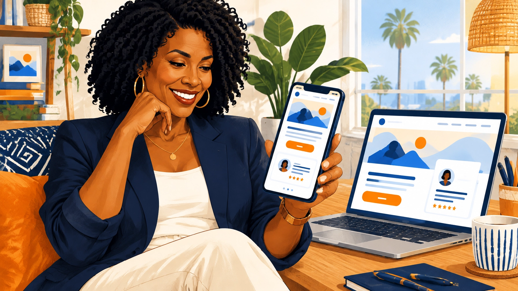
You’ve paid for a website. It looks polished. The colors are right. The photos are lovely. But the phone isn’t ringing, the booking calendar is empty, and the contact form seems to be enjoying a quiet life of its own.
If that sounds familiar, you’re in the right place. It doesn’t necessarily mean your business, or your website, is beyond help. It may mean your site looks finished but isn’t doing enough to guide a visitor toward the next step.
A professional website isn’t just attractive. It helps people understand what you offer, trust that you can help, and take action without having to solve a puzzle.
The broken storefront problem
Imagine a potential client walking into a shop. The sign is hard to read. The shelves are confusing. Nobody explains what’s for sale. The door sticks. Even a great product might not get a chance.
That’s what happens when cold traffic lands on a website with no clear offer, confusing navigation, or slow pages. Visitors leave before you ever get an email address.
Your website is the digital storefront for your small business, healthcare practice, or nonprofit. A visitor may arrive from a search, an ad, a social post, or a recommendation. They’re asking simple questions:
- Am I in the right place?
- Do these people understand what I need?
- Can I trust them?
- What should I do next?
A useful rule of thumb: make the answers clear within the first few seconds. “Five seconds” isn’t a magic deadline, but first impressions form quickly. A Stanford study on website credibility found that design and ease of use influence whether people see a website as credible.
If your site doesn’t build confidence quickly, more traffic may simply mean more people leaving. That’s the broken storefront problem. And it’s fixable.
Professional means clear, trustworthy, and easy to use
A beautiful website can still leave visitors unsure. A professional one makes it easy to understand who you help, what you offer, why you’re credible, and how to take the next step.
That’s the difference between a digital brochure and a closing tool. A brochure describes your business. A closing tool helps a visitor move from interest to action.
And “closing” doesn’t have to mean pushing someone into a sale. For a therapist, it might mean booking an introductory call. For a medical practice, it could be requesting an appointment. For a nonprofit, it might mean making a donation or joining a program. The right action depends on the visitor and the work you do.
At Buzz Ur Brand, we believe branding should feel like home: warm, authentic, and unforgettable. Your website can carry that feeling while still being practical: welcoming people in, answering their questions, and showing them where to go next.
1. Find the leaks with a conversion audit
Before changing colors or adding another page, look at the path a visitor takes from landing on your site to getting in touch.
Where might they pause? What could make them hesitate? Do they have to hunt for your services, read several pages to understand your offer, or scroll past a long introduction before finding a way to book?

A conversion audit maps those possible drop-off points. It follows the visitor’s journey and asks practical questions:
- Is it clear who this business serves?
- Does the page explain the service in plain language?
- Can someone find the information they need without guesswork?
- Does the contact or booking process feel simple?
- Is anything interrupting the path to action?
For a healthcare practice, a visitor may need to understand your specialty, location, insurance information, and how to request an appointment. A community organization may need to make its programs, eligibility, and next steps easy to find. Each audience has different questions. A useful website anticipates them.
The goal isn’t to add more content just to fill space. It’s to remove friction. Think of the audit as walking through your storefront with a first-time visitor, not assuming they already know where everything is.
2. Put trust where people look for it
Visitors don’t arrive with your full backstory. They may be meeting your practice, business, or organization for the first time. Help them feel confident with real, relevant proof.
That can include:
- Testimonials or reviews that reflect your actual work
- Relevant certifications, licenses, or professional affiliations
- Clear information about your team, experience, or approach
- Examples of results, projects, or community impact
- A straightforward explanation of what happens after someone contacts you

Where you place proof matters. A testimonial tucked away on a page visitors rarely see may not answer a question they have while deciding whether to book. Put reassurance near the relevant service, offer, or action, where someone is likely to wonder, “Will this be right for me?”
Keep proof honest and specific. One genuine testimonial is more helpful than a wall of vague praise. And for healthcare practices, follow applicable privacy and advertising rules when sharing patient feedback or other sensitive information.
Trust isn’t a decorative badge. It’s the comfort of seeing enough evidence to take the next step.
3. Give each page one clear next step
A visitor shouldn’t have to choose between five buttons that all seem equally important. When every option is highlighted, the path forward gets blurry.
Choose one primary action for each page. Depending on your business, that could be:
- Book an appointment
- Schedule a consultation
- Request a quote
- Explore programs
- Donate today
Make the button easy to spot and label it with words that explain what happens when someone clicks. “Submit” is technically a button label. It’s also about as welcoming as a locked door. “Request an appointment” is clearer.
You can still offer useful secondary links (like FAQs, directions, or service details) but keep them from competing with the main action. And make sure the action makes sense for the page. Someone reading about a specific service should be able to ask about that service without retracing their steps.
A clear call to action is a small kindness. It respects the visitor’s time and helps them feel oriented.
4. Make it fast and comfortable on a phone
Many people discover local services on their phones. If a page is slow, crowded, difficult to read, or awkward to tap, a potential client may leave before seeing what makes you different.

Check your site on a phone, not just in the desktop preview. Can someone read the text without zooming? Is the phone number easy to tap? Does the booking button stand out? Are forms short enough to complete comfortably?
Speed matters, too. Google’s research on mobile page speed found that the likelihood of a visitor leaving rises as mobile load time increases. The exact impact varies by site and visitor, but the practical lesson is simple: don’t make people wait longer than necessary.
A useful target is a mobile storefront that loads quickly and feels ready to use within a few seconds. Compress oversized images, remove unnecessary page elements, and test how the site behaves on an ordinary phone connection. A fast site is not just a technical nicety. It’s part of a respectful first impression.
Your website is part of a bigger system
Your website doesn’t work alone. It’s the place your other marketing efforts send people.
Search Dominance helps people find you through search. Organic Pulse keeps your brand active and visible between sales. Ad Math helps you measure and manage paid campaigns. But if the storefront leaks, even strong search visibility, consistent content, and carefully planned ads can send interested people to a site that doesn’t help them take action.
That’s why Website Conversion is Pillar 1 of The Ecosystem Engine. It gives the rest of your marketing a clearer place to land. Explore the connected pillars: Search Dominance, Organic Pulse, and Ad Math.
The goal isn’t to make every page pushy. It’s to make your site feel like a helpful guide: clear, credible, and easy to follow.
A professional website should feel like you, and help people move forward
You don’t need to start over just because your website isn’t bringing in bookings. Start by looking for the gaps between a visitor’s first impression and the action you want them to take.
✓ Check whether your offer is clear
✓ Place relevant proof where visitors need reassurance
✓ Give each page one obvious next step
✓ Test speed, readability, and booking on a phone
✓ Track calls, forms, and bookings, not just how polished the homepage looks
A professional website isn’t simply a pretty digital brochure. It’s a welcoming storefront built to earn trust and make the next step easy. Branding should feel like home (warm, authentic, and unforgettable) and your website can turn that feeling into a practical experience people can act on.
If you’re ready to see where visitors may be dropping off, book a consultation. We’ll walk through your current setup together and talk plainly about what’s working and what could work better.
Let’s build something unforgettable together.
Leave a Reply